About InterPow
InterPow is a full-service web and graphic design, marketing, and multimedia firm nestled in the scenic Hudson Valley of New York. We produce eye-catching websites for companies both large and small, and also provide music and audio services. Our clients depend on us for our personalized dedication and attention to their business needs.
InterPow’s other focus was web design. The company developed some of the first websites for local businesses. With a little help from their mascot, Nettie the Cow, no doubt inspired by the constant mooing of cattle next door, InterPow established a lovable and memorable brand. Radio ads featured Nettie’s iconic “moo,” and the logo, designed and recently updated by Michael, featured her stylized mugshot inside a vertical oval, inspired by a cartoon dog he had drawn in high school.
Nettie became a hit, and Michael even composed a tagline and theme song around her: “Holy Cow, It’s InterPow!”, featured prominently in their marketing. Businesses like Salerno Duane and Hope House got their first taste of a web presence through InterPow. The Internet was still new and full of possibilities, and more local businesses realized they needed a well-built website and a path forward in this fast-developing new medium.
In 1997, InterPow opened a game room called Teknights, painted in violet and located just off the main office. For a small fee, visitors could play first-person shooters like Quake against one another. This fun and competitive space may have been one of the first of its kind, at least locally.
Unfortunately, all good things must come to an end. As faster and more modern technologies emerged, users no longer needed traditional dial-up modems to get online. Although InterPow expanded to offer high-speed Internet access, it wasn’t enough to compete with the larger and more nationally recognized ISPs entering the market. By 1998, the ISP portion of the business had taken priority over web design, which was still seen as a smaller, more localized operation. Without a strong long-term vision to scale with the changing tech landscape, the decision was ultimately made to sell the customer base to a larger provider, BlastNet.
Michael continued supporting InterPow’s customers through the transition and maintained the InterPow brand independently, even as BlastNet hosted the website for a short time. During this period, InterPow expanded its coverage into more areas of New Jersey, Pennsylvania, and New York. However, by mid-1999, Michael left BlastNet to pursue a web design position at Music.com.
All in all, InterPow had grown from a small dial-up provider in northern New Jersey into a full-service web marketing firm by 1999, offering high-speed Internet access and professional web development throughout New Jersey, New York, and Pennsylvania. It earned a reputation for building cutting-edge websites at a time when web marketing was still in its infancy.
From 1999 until 2001, Michael kept the InterPow brand alive as a portal to playing online games, much in the spirit of earlier incarnations of the website, which also included online games.
Years later, under Michael’s leadership, InterPow continues this legacy into a new era. The company has developed successful Internet brands including North America Overland and Iron Miners, and designed logos for the notable web series Mines and Mysteries and Caves and Legends.
As a veteran in the industry, Michael has been instrumental in creating profitable brands on the Internet. He helped build CMS Forex, which in 2006 was ranked America’s 7th fastest-growing financial company by Inc. Magazine. Before that, he played a key role in growing Music.com from a small subsidiary of Music Semiconductors in 1999 into a globally recognized entertainment brand by 2001, with backing from Citigroup. Through a partnership with DreamWorks Records, Music.com helped launch the careers of artists such as Nelly Furtado, Papa Roach, and Gorillaz.
With the creative insight of Creative Director Sage M. Hetman, InterPow blends Sage and Michael’s rich industry experience into an innovative web design company for the 21st century.
Let us build a distinctive web presence that works for you.
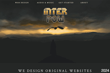
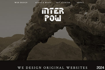
InterPow has also exhibited custom artwork and photography on its website over the years.





North America Overland Ranked #3 by Autoweek
November 1, 2020
InterPow's client North America Overland (NAO) was just rated one of the best Land Rover restoration companies in America by Autoweek! A long time client, InterPow crafted NAO's logo and brand from the ground up, following the vision of founder Mike Sandone, and continues to maintain the website today. Kudos to the team at NAO for their exceptional hard work and dedication which has earned them recognition from this prestigious publication.
Lost Revenue During the Pandemic
September 10, 2020
What are you doing during the pandemic to make sure your business or organization is still bringing in revenue? With leaving home remaining a risky proposition for many, opportunities exist to run or promote some core functions from your website.
If you aren't currently accepting payments through your website, a simple PayPal payment button is relatively simple to setup and will allow prospects to easily make a purchase or donation, regardless of whether they already have a PayPal account. This is because PayPal now allows you to make your payment first, then decide whether to store your information in a PayPal account for subsequent payments. In addition, your payment is still made securely through PayPal, and the same fraud protection measures apply. If you are a non-profit, you may even accept donations through PayPal.

For organizations that rely on social gathering such as regularly scheduled meetings, substituting these dates with a virtual Google Meet or Zoom meetings may inject a feeling of connectedness to drive the agenda forward. Public events or shows may be substituted with virtual live events. The live events may be accessed through your browser, provide links to shopping carts, and only be available for a limited time, to impart a feeling of urgency.
If you have been considering adding a shopping cart to your website, there has never been a better time than now. Your shopping cart will allow you to conduct business even while you're sleeping. Many solutions are available, scalable to your unique needs.
InterPow can help bridge this gap in your business or organization. We are already assisting our clients in these areas.
Mike Hetman
Another decade of web design
December 30, 2019
As the year closes out, it is once again time for reflection. The expectations for a well designed website have increased, probably exponentially. A decade that began largely with full screen layouts optimized for desktop screens, has gradually embraced mobile becoming the dominant vehicle for the Internet experience. Skeuomorphism has been replaced by minimalism which is finally being realized as a trend and being re-evaluated due to its lack of humanity. Old practices have been abandoned, will be forgotten, then rediscovered. What will the trend setters invent next?
In the meantime, as a professional web designer, I will try my best to identify trends for what they are and embrace forward thinking and timeless applications in design. The history of web design will eventually identify distinct phases where the evolution of technology and permanency of certain trends coalesce. How will your website fall along this continuum?
Mike Hetman
Designing my approach to web design
October 26, 2019
As someone who has spent the majority of his professional career building and maintaining websites, I have played every role from cog in wheel to captain of ship. While I studied programming languages such as C, C++ and assembly language in college, I desired to produce a visual aesthetic in my work, not just code. Having dabbled in graphic design for years beforehand including crafting ANSI art for Bulletin Board Systems, the role of Web Designer, seemed very appealing — a blank canvas that would allow me to follow my passion for art and design while coding to build the foundation and control moving parts.
Growing up I was fascinated by album cover design, especially of hard rock and heavy metal bands. I enjoyed seeing how the logo and accompanying visual or illustration painted an impression on the music. And I appreciated how the choice of fonts in the lyrics and credits impacted the narrative of the album to create a cohesive and compelling package. If album cover design could immerse you more into the music, what other things could strong design immerse you into? This spawned my interest in logo design and branding and ultimately impacted my approach toward web design.
I incorporated these principles into my web design work and further developed them over the course of my career. While a Senior Web Designer at Music.com, I was given the opportunity to design websites, Flash animations and web art for upcoming and established music artists including Placebo, Lou Reed, Samhain, Tega and Sara and others.

After my position at Music.com expired, I aspired to paint the same level of excitement over band art design and branding, to more traditional design and branding. When I was commissioned to design a website for Hydronics Enviro Corp., a company that custom engineered solutions to remove and recover particulates, fumes and mist, it was as far from rock and roll as one could get. However, after I had time to review their brochures and learn about their technology, I could feel myself gaining the same level of excitement as I felt designing music websites. At the end of the day, one’s excitement over a service or product is only related to their individual needs or the needs of their organization. If I could garner a level of enthusiasm about a product, service or organization, no matter how not hip or square they are, I’ve done my job.
Mike Hetman
Was early web design ever good?
May 30, 2019
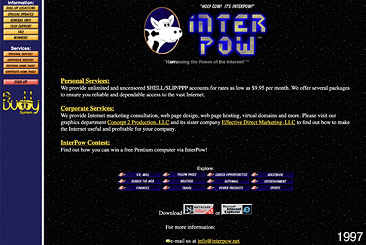
When I first began my career as a web designer, it was at InterPow. The year was 1996. The "World Wide Web" was in its infancy. 56k baud modems were the latest craze in turtleback Internet access. And as a web designer, that speed, or lack thereof, dictated that every image be unapologetically compressed and reduced into a small yet discernable pulp suitable for EGA graphics card “interpretation”. An elegant and methodically thought out design was reserved for print only. In this day, your lowest common demoninator was running Windows 3.1 with maybe the not most updated version of Netscape, or worse, Internet Explorer.
This is where my web design career began. And even in the year that followed, any effort to push the envelope was met with fierce opposition consisting of a barrage of incoming tech support phone calls complaining that our website was loading too slow. The user experience always required immediacy! I remember responding to the allegation by decreasing the size of the InterPow logo, so the page would load faster! The calls stopped.

Since InterPow was initially an Internet Service Provider, our clients were largely dialup users reaching the company website only as a starting point to advance into the unknown world that is not InterPow. If they couldn't successfully get through our website, the assumption was they couldn't get to the vast Internet beyond. Google? Sorry, it didn't exist.
Many website designs in the 1990s retained this distinctive character: small tightly compressed images, with Times New Roman or Arial content hovering loosely and sometimes unpredictably over an often distracting patterned image background. But this new medium was different, new! It took a few years before Internet speeds allowed web design to flex its muscle. This initial period of web design was so hindered by the limits of the technology, that today, it seems inconceivable that anything produced from this period could stand the test of time. Could one argue this era of web design was artfully executed given these extreme limitations?
It would be easy to judge early web design as crude, or just bad. But perhaps someday it will be appreciated as an art bound by severe restraints, much in the way 8-bit art has enjoyed a resurgance. Or perhaps, the trials of seeking a way forward, are forever cast as school children drawings by inspiring artists, web designers and future CEOs. Internet historians will have to be the judge.
Mike Hetman
